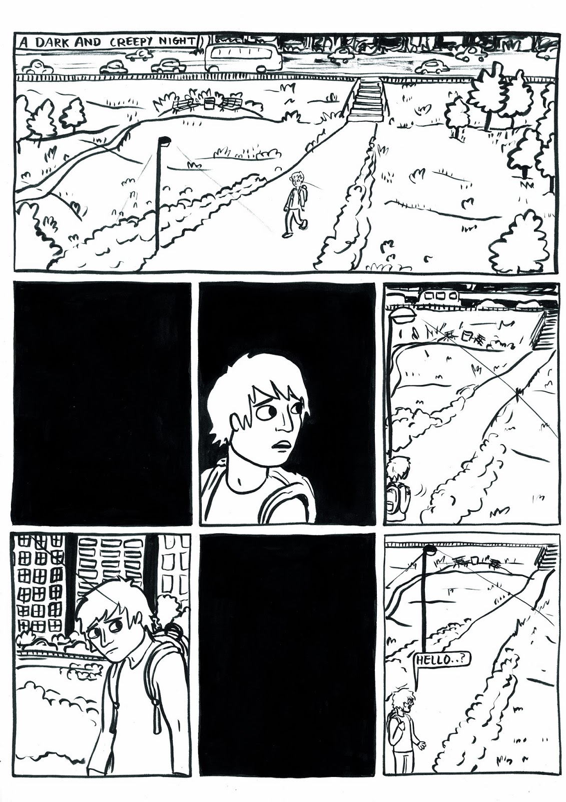
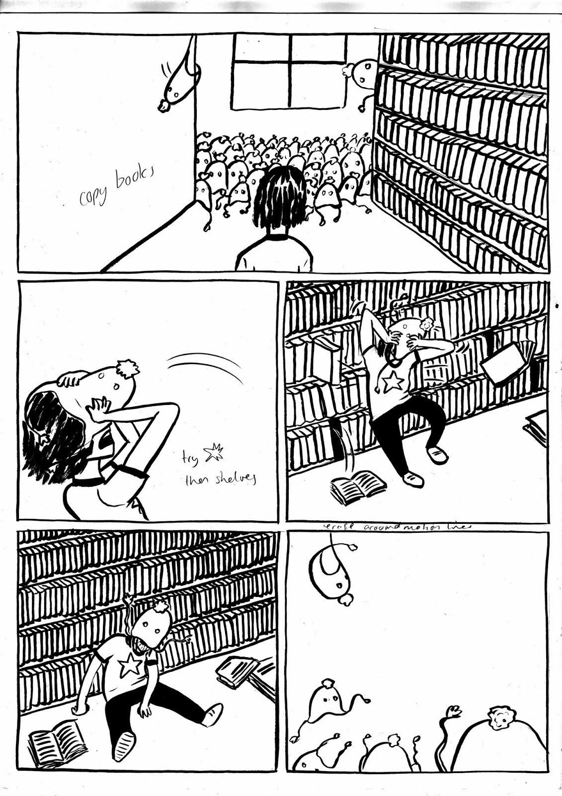
Here are scans of my inked pages. After the mock up I went straight into making the finished pages. I was using a medium thickness white card in A3, I wouldve preferred to use a3 bristol board but i couldnt afford it, so maybe next time. The card wasn't great, it had a nice smooth surface but there was quite a bit of bleed when it met with the ink i was using (pentel brush pen, black cartridges). I chose to work on a3 because I wanted the final book to be a4, and theres no way i could draw a page of neat panels on a3. I find downsizing makes the linework neater too.
Left two panels black to write in white over them on Photoshop
Left black colouring and copying a panel to do in photoshop
going to erase some of guys mouth, too open, wrong expression

copying previous face close up panel to cut down on workload

not happy with composition of this page, people will move to right corner and two redrawn to look the right way, crocs will be extended downwards. Also correcting error of skirting board going over door, silly me..

Since I foolishly chose to set this part in a library there's a ton of books to be drawn. I decided i'd draw long parallel shelves so i could copy them onto the rest of the shelves, again cutting down on my workload, and making the books appear more uniform. Here I'm copying just books, then a whole wall of shelves symmetrically, then a body that doesn't need to change.
copying books and a whole panel where I just want to show there being nobody there still, so why draw it again. I need to add in the rucksack I forgot about and change a weird hair and nose interception
since I drew the library desk in the previous page I'm going to copy it and slot it behind this top panel viewed from the same angle. Its slightly taller so I'll have to extend the lines. 

This was my least successful inking page. The first panel is supposed to be cartoon whirling running legs but the arc isn't round enough, i shall correct this and add in the background. The face and hair second panel are an inexplicable disaster. I tried to draw the hair blowing backwards but from a head on angle that was tricky. When I redraw it in photoshop I will make the hair flip up instead. I think the position in the third panel is very awkward and uncomfortable, he looks like a wooden puppet, not very human at all.
I like the break in the middle of this page as they are all seen at once. I have to erase some of the border so the book can fly over it.
Going to copy the books, correct the fallen ones that don't correspond with the previous panel, and copy the posture for the last panel so he doesnt move at all as the hats swarm in
must erase line inside creek. I had to add some bedroom stuff into this one to fill up the space around the bed.
I struggled to get a good amount of movement into the coat jumping up and then pouncing. My motion lines need some serious work.
I wanted this page to be a dynamic fight with an abrupt stop, i chose it to be a quick turnaround of a fight so it looked like she had a chance at survival
This is where the character I cut out earlier comes in. I didn't get to explain who it was but I'm not sure it matters, hopefully its clear enough from her instant and natural attempt at interaction.
Here I used bigger panels to slow the pace right down when she realises her doom and stops fleeing. The bottom panel took a LONG TIME. I went back through my research and clad the crowd in all the trends I'd thought of but not used as a main 'villain', like fedoras and mullets and fake nerd glasses.
Here I was aiming for a faux-dramatic betrayal. I chose to make the crowd faceless shapes in this panel to focus attention on the two in the middle and avoid making it too busy. Also it wouldve taken forever to detail them all and for little yeild.
This is the last page. I used three aspect to aspect panels to pan over the details of her new outfit. I added more clothes to the previous characters to make the apocalypse feel more imminent. To balance out this panel I added an exiting face staring deadeyed into the camera. I may add eyes to the hat as to suggest a visiaul 'to be continued' or maybe 'im coming after you now'
It was an effort to keep the placement of the bricks consistent
I think after this project I need to work on my inking skills as often the lines aren't as thin or tapered as I intended, perhaps it just got sloppy as I was rushing, if this be the case i must allow more time to ink. I also need to practise drawing human figures as some of the proportions and positions are off in these drawings. I'll use more reference next time and I've signed up for the next life drawing session.


No comments:
Post a Comment