Thursday 25 February 2016

Cat update

 Cat drawings to put into the scene, because I forgot to draw them into it.
 I scanned in my cat drawings and made them separate line drawings using channels

 I coloured each one with this process, a layer of blueish colour behind the linework..
Texture on top with pastel palooza to make them less stark and avoid looking like in hana barbara cartoons when the background looks way different to the characters on top and you can tell which rock is gonna move because its like flat colour and not painted
 yellow highlights from the moon
and ta dah, they are done

Nicola Bayley

The Mousehole Cat

Will said the texture on my tantrum o furrily drawing was like this, I can't imagine how she made this texture without Big Wide Softy from Kyle's Megapack.
I am such a product of my generation.

Her paintings are pretty marvellous though, very whimsical.


Made up bilogical make-up

I want to do all the school diagram type information for the creatures of the heady leggy planet.

I'll do bodily cross sections and skeletons of the heady leggys and the creatures of the planet.
Like this guy, Michael Paulus


And I want to make like botanical charts they have in schools and science books of the made up plants.
I got a nice book out of this, its called the art of instruction; vintage educational charts from the 19th and 20th centuries.


It is very pretty


So yes I will do this for the things of the heady leggy planet
And maybe the planet itself like the earth core diagram

Tuesday 23 February 2016

Mallrats

Adam didn't want to screen The Man Who Fell To Earth cos he said no one would come, so we changed it to Mallrats which I love very very much and I made this poster. 

I was going for a combination of 90s gig posters and 40s adverts where they'd colour in black and white photographs.
Because mallrats embodies 90s layabout college student grunginess, and I was reading a book of 1940s adverts the other day and wanted to some kind of digital photocollage colouring in thing at some point. The tight deadline made this the ideal time. 


Here are some revisions and decisions


Here is the result


I like it I think its highly obnoxious

First Page Progress

I have made a start on the imagery for Tantrum O'Furrily

I drew these rooftops, with Adam's help, which were based on the rooftops in Mary Poppins when they sing Step in Time. 

http://www.mbetancourt.com/wp-content/uploads/2013/07/Screen-Shot-2013-07-16-at-4.44.12-PM.png

I used this nice brown pencil thats quite waxy so it has a really fuzzy line


It was too big to scan in one go.  

Then I put them in Photoshop and made some spooky night time sky
Then I put the smoke on because that is how I am demonstrating the wild and windiness of the night. 


I highlihghted it and the buildings in yellow, and coloured the builing in various shades of night timey blue.

Then I made the smoggy background more colourful as feedback deemed it too dull


 Much nicer

I wanted the curly handwriting on it but it was taking forever to write everything out and scan it in so I tried making a typeface out of my handwriting.
This is a mostly useless endeavour unless you're using the smoothest of smooth brushes because it makes each letter a vector type thing and messes it all up in the process.
As demonstrated here.  

 This is what I put into the generator
 This is what came out
It looks like Curlz MT.


Nope thanks nope...

So I gave up on the curly handwriting and used Futura instead.

Much more efficient.

Next I have to do the rest of the text and put the cats in.
I'm going to try and get some text in the wider smoke plumes but this may be an enormas faff.

Some sketchies

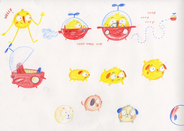
Had a little Heady Leggy brain dump
Working out dogs and movements and reproduction
Adam said the one where he pulls a bit of flesh off is too gross but I kinda like it I dunno, maybe if he looked less in pain.


Big Moon

Working out the make-up of the world, how it differs from ours and such
I think the circle is pretty important to this world which for now we shall call Space Planet, or SP.
The houses I think are very round and somewhat like Futuro houses which are cool as hell.
They should be on legs and maybe this is beacuse theres lots of water which explains the bouyancy of Eddy when dropped in the sea by a gull.
The moon is part of the whole thing I think hes a nice guy who means well but causes endless devestation due to being too damn large. This means much flooding and a fairly watery planet. 
I don't know I'm figuring it out but here's some drawings

 I thought about this being the Pan Macmillan entry, a book exploring the SP and its general ecology and ways of life but in the extraordinary circumstance that I win that means they would own the whole damn thing so I think I'll just stick with the seaside thing.

Saturday 20 February 2016

Plan

Made a plan to fit on one page that I can refer to when making the roughs and finals.

It's helpful to see each composition at the same time to figure out if it'll work.
I want to have elements of comic panelling but not too much that it becomes an actual comic. Laying them out like this helps to get an even weighting of full page images and panelled images.

I'm going for imagery that fills the page, I think its immersive like that, I prefer picture books where the whole frame is used rather than a series of spots, white space is the devil.

Right now I gotta do em all.

Heady Leggies again and again

Here's some more Heady Leggy though dumps.

So the houses will be like Futuro houses but rounder, more pod-like, with leggy stilts


And here's a little collage I gone and done


Heady Leggy Update

Following my tutorial I am abandoing the animated pilot plan and instead developing a universe.
Basically my big project is to make this character and his world and everything in it.
What his people are like and where they live and what they eat and what creatures they live among and what they sing in the morning and what happened historically on the planet to make it whatever it is now and what they build their houses from and how Eddy relates to all of this stuff.
After working all of this out I will build the franchise of this, proposals for products, books, shows, games, promotional materials and endless endless merchandise. 
 Somewhere in the middle I'll knock out a Pan Macmillan Submission.

Eeeeeasy peasy..

Here's some dogs and ships 


Friday 19 February 2016

Kitter Catters

I've been drawing a buttload of cats for this Tantrum O'Furrily brief, I think I must fully understand the cat, become the cat, live breath and eat the cat.
But not eat the cat.

These are some cats I drew at work while I was supposed to be doing pointless admin.
Due to all the NHS confidential information on the back of the paper I had to photocopy them with the fax machine from the 80s that screams when you touch it.

I like the one I coloured in orange best. That's why he's orange because he's the best.
Cat eyes are the way forward, goggly eyes are too manic and upsetting.

Painty Cats

I have painted some cats
They are gouache and brown coloured pencil for deets.
I like the ones with the asterisks best.
They were becoming so fat that they were almost imobile, at which point I scrapped that and did the toppish left one with a star next to him
I think I will go with that one because he looks like he can walk more than two yards unlike the rest of them. 

Thursday 18 February 2016

Tantrum O'Furrily

So Theresa sent this competition out a while ago and I decided to give it a whirl because cats and picture books are my main two raisons d'etre.
Also it's written by the woman who wrote How to Train Your Dragon.
I signed up a bunch of times to get the text and never recived anything until about a week ago when I got like three copies through.

Here is the text.

https://dub112.mail.live.com/mail/ViewOfficePreview.aspx?messageid=mgh4mkRAzP5RGtZQAjfePx5A2&folderid=flinbox&attindex=1&cp=-1&attdepth=1&n=75840344

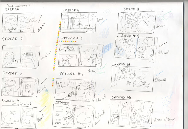
It's not bad, has some pretty evident imagery I think, so I've planned out the thing and now I just have to make at least four spreads and a decent story board.
I plan to combine comic panelled elements with full page images because some of the spreads have far too much text on them to be communicated effectively through one image.

Here are my very ugly plans.


Wednesday 17 February 2016

Tuesday 16 February 2016

Kids books

Looking at what's going on now in children's books to take some reference from stuff that's actually managed to get published.

I saw these lovely things at Salts Mill


Little Gestalten is a new fave. Real nice.

Also went in Foyes when I went to London recently. Phone is too crap to take picutres but here are some I liked. There were so many it was quite heartening to see such variation and mass of really well designed and considered childrens books. Also daunting.

Anna Kovecses - great block colours, has a 50s Scandinavian feel


Published by Wide Eye, an offshoot of Quatro. They publish original non-fiction works for kids. That would be grand fun, I'd like to try a non-ficiton topic. I like that theres the impetus to make dry information accessible to kids and simple brains like mine.

http://www.quartoknows.com/imprints/2072/Wide-Eyed-Editions/?page=0#titlelist

they have a bunch of nice books


Also been looking at Hachette Childrens group as they're running the Carmelite Prize competition so it'd be useful to know what they already have and what kinda stuff they publish. 

They're quite a lot more mainstream than other publishers I tend to look at but mainstreams where the money is.

Looking at their site it's clear they've published absolutely loaaaddddsss. I'm on page 7 of picture books and I'm still on the letter A. 


I'm really feeling this cover. 

Ahh, Penguin Small was one of my favourite books as a wee kiddy. My mum made this cool plush story kit matt thing for college based on it with all the characters and stuff.

Mmmm very nice, very french moderrrrnee

They have a wide range of stuff from these really nice things to like My Little Pony stickerbooks, but most of it is pretty decent. There's so much I didn't look through everything

Here is a small selection from my own collection, acquired from charity shops and car boots etc. 
They are my main source of inspiration but the problem with that is they were all published a long time ago and in no way reflect the position of childrens publising today, hense the importance of looking at the other stuff, but nonetheless my loyalty will lie with weird ass books I find second hand, and that is not a thing I expect to ever change. 


Monday 15 February 2016

Imagine pattern

It wasn't looking right doing all the different faces so I've changed plan and I've drawn this


They are all the people sharing all the world
I think theyre pretty cute
Just gotta scan it and play with it a bit now

Cressinda Cowell

The text is written by Cressinda Cowell, who wrote How to Train Your Dragon, which I haven't read but I really liked the movie. I remember it being very refreshing in a time saturated by naff and unimaginative cgi movies.
I haven't seen the second one yet


The success of the movie, for me, was attributable to a solid story with likeable and believable characters in a well logically-established half fantasy/half historical world. Having not read the book I can't say for sure this was thanks to Cressinda's writing, but I'm pretty sure.

She illustrated the books herself, and while it's not really my thing I do enjoy the uninhibited movement in her sketch-like drawings and I can see why children really connected with them.


Also I like that the first edition was published under hiccups name and translated by Cressinda


It seems what she likes is general whimsy and naivety, as would be expected for a childrens book author. Since she's judging, and it's her text, I'd better try and capitalise on whimsy and movement as best I can. 


I'm comin ter get yer cressinda