Sunday 30 November 2014

Print redesign

Following my tutorial it became apparent that my print ideas were rubbish. I had a feeling they were.
I suppose the pressure to settle on an idea quickly so as to allow myself ample production time lead me into panic, which resulted in lazy designs.
I've redesigned them on the theme of speech bubbles, still focusing on the characters but now there's a link between my animation and prints. I've chosen quotes indicative of character,
Rorschach - They'll look up and shout save us and i will whisper no - arguably most famous/one of,  in book - contempt for others and assumed power
Dr Manhattan - We're all puppets Laurie I'm just a puppet who can see the strings - complacence and actual power, omniscience
Nite Owl - Looking back it all seems so childish, like a schoolkids fantasy that got out of hand
Ozymandias - I don't mind being the smartest man in the world i just wish it wasnt this one
Laurie - There's no such thing as quitting, just sometimes theres a longer pause between relapses

Each will be in a speech bubble with items and motifs representing the characters in applicable colours

My favourite is the comedian design with the cigar. It looks the most balanced and complete.
The scale difference between dr manhattans big hand and his little watch may prove difficult, as it did in sketches. Consider normal size hand or alterations. Mars palace could work but is very complicated and would be infinitely stressful to produce. Also that strays back into the territory of recreating someone elses design.
Same with nite owl's archie ship, recreating existing designs.
It's very difficult to avoid when working from visual source material.
Motifs could be the way, like comedians cigar. No infringement on a cigar.
I played around with my hand writing trying to make something vaguely presentable and arranging the quotes in different ways. Oddly enjoyable.
I think I'll hand draw the quotes, if I can achieve an acceptable aesthetic.

Accidentally my animation plans are in this issu document so lets discuss that.
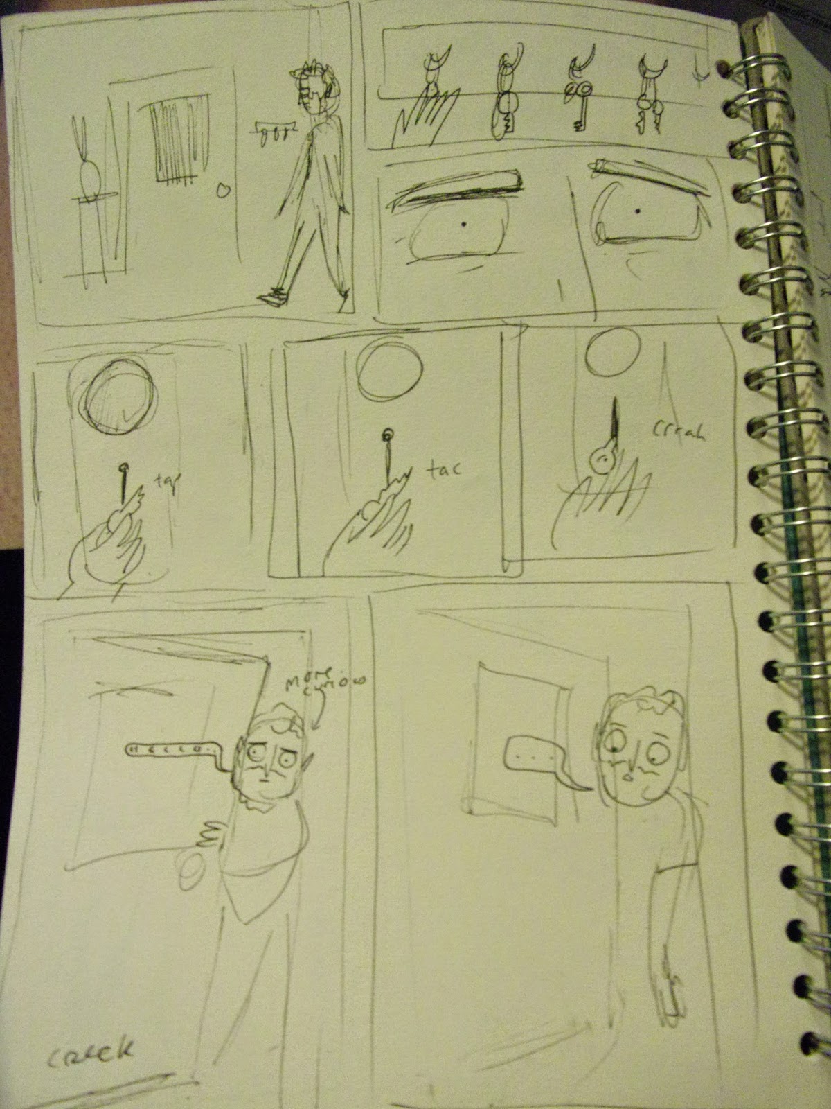
Following my enjoyment of animating Alan Moore's quotes I've decided to do it again but better for the animation. I've gathered some particularly visual quotes and narrowed them down to three, for which I made these storyboards.
I'll perhaps also remake the magician animation in a less scrappy manor.


Tuesday 25 November 2014

Dr Manhattan in progress

Scanned in the line drawing, shuffled it about a bit but using it as a guideline so I can draw accurately using no lines 

Without lines, used textured brush but might not translate to screenprint/bitmap

Blue alone with white showing through, will require trial and error screen printing

Pink layer for skin and glow/shadow on Manhattans face


Testing how the three colours will overlay in Photoshop, will work in theory but perhaps not in practice. 

print designs

some ideas for print
displaying the dual personalities of the characters 
i can layer multiple inks and shades in screenprint, make up for the lacking concept with craft..? 
although since im not particularly confident with my abilities in print maybe craft isnt the best angle to go down.

Alan Moore Quotes to consider (a post in progress)

I've no objection to the term 'graphic novel,' as long as what it is talking about is actually some sort of graphic work that could conceivably be described as a novel. My main objection to the term is that usually it means a collection of six issues of Spider-Man, or something that does not have the structure or any of the qualities of a novel, but is perhaps roughly the same size.
Good quote but not very visual, summarises opinions towards famed medium though

Life isn’t divided into genres. It’s a horrifying, romantic, tragic, comical, science-fiction cowboy detective novel.
Very visual, perhaps too short? Combine with other quotes but how? 

I despise the comic industry, but I will always love the comic medium.
Again, not instinctively visual but could be worked with, short so combine with others? 

Sexually progressive cultures gave us mathematics, literature, philosophy, civilization and the rest, while sexually restrictive cultures gave us the Dark Ages and the Holocaust. 
Demonstrates racier side of personality, very visual and a good length for full animation
 did an interview where I was asked for the best advice I'd been given. I couldn'€™t think of anything, so I read from the back of a packet of Swan Vestas matches by the phone: "Keep in a dry place, keep away from children and strike gently away from the body." They'd written it up without any sense of irony.
Requires condensing but well summarised

I suppose that the main drive is to find the edge of something and then throw myself over it.
Good summary of creative practice, visual and could go with other shorter quotes, consider how to compile these in a non-fragmented way, would it be too against the brief to have ten second stings about documentary? Probably

The movements of the mind don’t follow any linear pattern, they can’t be explained with a mechanistic, clockwork view. 
Focus on creative practice?

On my 40th birthday, rather than merely bore my friends by having something as mundane as a midlife crisis I decided instead to terrify them by going completely mad and declaring myself a magician 
Explores other aspects of crazy life but perhaps too long to not be focus of animation, which takes away from point of 'documentary' 

TBC


    Printed Pictures Brief

    Brief
    Book covers for Watchmen focusing on the theme of dual identities in the main characters and the balance of those identities and the differences and similarities in order to re-release the books to attract an audience of existing fans/collectors, newcomers to the book and genre and young people who weren't around to enjoy it the first time.

    Background Considerations
    Conveying characteristics and tones of characters; Rorschach, Dr Manhattan and Night Owl
    Rorschach - discomfort with being unmasked and showing face, psychotic tendencies, assimilation with mask, unhinged, violent, grimacing distain for others, conspiracy minded, low tech
    Dr Manhattan - distaste for futility of human kind, incomprehensible wisdom, cheerful/hopeful glint in the eye of old self, sad beaten down victimised bearer of cancers for all, omniscience, naivety and human-ness of former self and contrasting lack thereof as Dr Manhattan 
    Nite Owl - Intelligence, sensitivity, voice of reason, safe and level headed comparatively, care for fellow watchmen, Archie, gadget man, high-tech, full effort 
    Using screen print in the key colours of the imagery within the book and the key colours recognisable to each character
    Consider the differences and similarities between each characters identities in reference to the text

    Deliverables 
    3 Screen printed book covers using 3-4 inks on each, inks can differ between images but must stick to a consistent visual style. High level of craft required

    Deadlines
    Initial print tests and all completed plans for images Friday 5th December
    Additional tests for subsequently planned images Friday 12th December
    Screens prepped and ready to go Thursday 18th December (all subject to availability of print room)
    Print after Christmas in good time for deadline of 21st January, plans subject to release of print room schedule after christmas

    Monday 24 November 2014

    Printed Pictures Project Proposal

    I intend to produce...
    A series of book covers for Alan Moore's Watchmen and an accompanying poster

    The content will focus on...
    1. The dual identities of the main characters
    2. The differences and similarities between the two
    3. Loose interpretation of visual noir-esque style of watchmen drawings

    I will be aiming to communicate
    1. Complex characters featured in book
    2. Intriguing snapshot of book and characters for new readers
    3. Timelessness of story, making initial visuals more contemporary

    To an audience of
    1. Existing fans of the book
    2. People who know of Watchmen but were never that bothered about it
    3. Youth who missed out on it the first time around

    Saturday 22 November 2014

    Printed Pictures Crit

    We did the crit wrong but here is the feedback I got from what we did do.

    Comment on selection of themes, content, concepts or messages (are they specific enough and are they appropriate to the selected author, texts or research?) 
    -Very simple concept but should be justified by high level of craft in multicoloured screen prints.
    -Content is appropriate to book as it informs new readers of main characters and theme of split identities and plays on familiarity of characters for existing readers.
    -Be sure to make a clear distinction between the two halves so it's plain to see that they are two separate 'characters', for this reason perhaps remove Laurie as her two identities are visually similar. Only experimentation will tell.
    -Also make use of the backgrounds, making them appropriate to each character and perhaps changing for both face halves.
    -Do research into previous uses of concept in posters and comic books (spider sense half mask from 90's)

    Comment on the visual concept of the proposal (are the decisions made about aesthetic, media, colour etc appropriate to the intended tone of voice, mood and/or concept? 
    -A lot of experimentation still to be done to hone in on style images will be created in, difficulty is to find the correct balance between making the characters recognisable and the visual familiar but not just drawing like Dave Gibbons
    -Go with plan to use the pale but rich colours of Watchmen, key colours for each character i.e blue for Dr Manhattan, but work out how to make the colours for both sides of character complimentary and how to make multiple colours out of fewer inks
    -Experiment in print with overlaying inks and bitmapping the image to combine dotted areas and create extra colours
    -Consider visual link between the set and if thats necessary considering they have a strong visual theme running through, but definitely ensure that all colour palettes are complimentary and work as a set
    -Work out where type will fit and what type will be used
    - Consider matching shadows of Rorshachs face with marks on his mask

    Comment on the clarity with which the audience and or context has informed decisions relating to format size media and content 
    -Appropriate to all audiences, perhaps less so the new readers but it isn't too confusing that they wouldn't understand, most would be familiar at least with the main ones.
    - Can also consider additional audience of readers who enjoyed the novel the first time

    Time Planning
    -Consider in greater detail after initial problems have been ironed out
    -Aim to complete plans by next Friday and create test prints of each within the next two weeks to trial bitmapping and overlays
    -Design one and make test print before continuing with others in case process doesnt work how planned, allows time for reconsidering, aim to print next Wednesday, perhaps scaled down for simplicity
    - Ensure screens are prepared and all tests are done and everything ready to go by Christmas, print afterwards
    -Time planning will prove crucial, set aside some time to figure it all out and get organised, asap

    Actions
    -Research existing comic covers containing similar themes and visuals to get a good basic knowledge on what has come before and gain inspiration from this
    -Try out actual drawings to figure out visual style problems
    - Consider contents of backgrounds and how they will relate to characters, shouldn't be an afterthought
    - Experiment with how to make the images different to the original drawings but to still hold the same familiarity
    - Plan time and organise workload, using diary
    -Re-read brief to check it fulfils requirements
    -Do rigorous testing in time for christmas


    Thursday 20 November 2014

    Thoughtbubble


    Thoughtbubble is very different from the other side of the table. Having attended for the past three years I thought I had a good idea of what it would be like but it was more of a gigantic learning curve.

    Stuff I've learnt:

    Preparation is key - I was not prepared in advance and this made the run up to Thoughtbubble INCREDIBLY stressful. I did all-nighters and everything. Next time I will start doing things from the minute I book my table, but along side other work, rather than sacrificing college work to finish the things I planned to do for this. I didn't get to do everything I wanted to, like adding to my old comics and finishing my new ones to a good standard. I didn't allow enough time to print and produce and were it not for Rowena's assistance none of my comics would be trimmed, folded or stapled. 

    Front covers are important - I have a tendency to put a lot of effort into the contents of a comic but by the time I get to do the cover I've usually ran out of time and I just slap something together at the last minute. This hasn't been a problem before as I've been giving them out for free but when I want people to buy my comics all they can see at a quick glance is the cover, there's no way of them knowing if they'd enjoy the story  

    Fan Art - I realise I have undervalued fan art. As much as I still think it's a cop out and that people should create their own characters and worlds to make work based on, I now realise there is a market for it at Thoughtbubble and in terms of profit it is very valuable. Who's to say there's more integrity in writing stories anyway.

    Quality - Looking at other people making similar work, I noted that their things were of a lot higher physical quality. They were printed better, in colour or at least the covers had colour, and more thought had clearly gone into the things they were selling. Overall other peoples things appeared a lot less rushed than mine did.

    Table Setup - The more professional looking tables had more care put into the setup of their tables, they didn't just cram all of their things onto the available space like I did. There's decorative elements to consider, also more professional looking stands and nicer ideas for displaying work like hanging prints on a washing line on the front of the table.

    Rude Browsers - An irritating amount of people would approach the table, read the entirety of one of my comics, put it down, smile and walk away. I don't know why they thought that was okay, especially when the thing they read was usually only a pound, and I have no idea how to prevent this next year other than calling them out on it, which would probably just create a bad atmosphere. This requires further consideration.

    'Networking' - The most enjoyable part of the whole thing was just talking to other creators. I noticed it was massively different to talking to them as an exhibitor than as an visitor as our gold wristbands automatically established a level of equality and solidarity, leading to more in depth conversations based on an assumed level of knowledge. I was on the end of our table so I sat next to Dilraj Mann who is a lovely person and we bonded over many things from creative processes to the idea of a world populated entirely by hardcore nerds.


    Wednesday 19 November 2014

    Stupid Deaths extended

    I decided to print some more copies of Stupid Deaths that I made last year so I could sell them at Thoughtbubble. The problems I had with it before were that there weren't enough pages, it wasn't clear that they were true stories that I hadn't made up and there wasn't a glossary of the peoples names. I planned originally to add three more comics to it, but I only ended up doing one more, again because I didnt allow enough time.
    Anyhow, this is the comic I added to it 

    I like the coloured version better even though I just picked those colours to fill in the space with enough texture and tone to make it fit in with the others.

    Tinder Men

    As a lazy idea for something to sell at Thoughtbubble I decided to expand upon something I did in the summer, which was drawing men from tinder. I realised it was an infinite source of human faces.


    So I drew more, both randomly selected and ones with funny descriptions, which werent I hadnt included at first but I think they add a lot to the images. 

    The drawings were done in a lot of different colours and pens, mostly just so I got round to playing with them and so the task didnt get boring.
    Because of printing costs I had to make it black and white but I think it looks more uniform this way anyway. I'm pretty happy with how it turned out, all the images go pretty well together despite the fact I did them all at different times with different pens. 
    I forgot to put my name on it though


    Moving Pictures Project Proposal

    I intend to produce
    A 30+ second (time dependent) hand drawn animated sting for documentary on Alan Moore's life/creative process visualising quotes (yet to specify) about topic

    The content will focus on
    1. The crazy yet poignant things Alan Moore says and the enthralling way in which he says them
    2. Reflections on his own creative practice
    3. The visual nature of the things he says, using the verbal imagery to create visual imagery

    I will be aiming to communicate
    1. The fascinating wisdom of this man
    2. The carefully considered flamboyance of his speech/words
    3. The deep thought put into his work methods and philosophies which can be transferred to all disciplines

    To an audience of
    1. Fans of Alan Moore
    2. People who aren't familiar with him or his work but by chance see the sting advertising his documentary
    3. Fellow workers of the creative and comic industries


    Giant Tess Final

    Finished Giant Tess comic.
    In the end due to poor time planning I ended up doing this within about 24 hours which meant I had to cut quite a few pages out that I liked but weren't essential to the story. For this reason I plan to redo it some time in the near future because it didn't end up being the comic I wanted it to be. However I'm not entirely dissatisfied as I managed to complete it in time for Thoughtbubble to an acceptable degree. Had I allowed more time I would've also made it less scrappy, the linework and shading have suffered considerably but it'll do for now. 

    More Giant Tess planning


    Final plans for Giant Tess.
    Due to time I ended up only planning out the story properly once so it's a little rough around the edges, but overall I'm pretty happy with it.

    Giant Tess Planning

    At first I was thinking of telling snapshots of Tess's entire life and how her giantness effected it, started from birth (but that would be gross so she arrived on a doorstep)


    I was going to have a full page image to divide the different 'scenes' of important parts of her life


    As much as I quite liked a lot of these plans I realised there was absolutely no way I could tell her entire life story in one zine in the time I had left, so I formulated the plan below, wherein we meet Tess as a twenty something year old living in a mountain and hanging around with her best friend. In this revised edition the story focuses on the friendship between the two and then a man giant who Tess likes but he turns out to be a terrible person.


    To start this off I did some sketches of what the man would look like 


    Scott Pilgrim Poster (plan)

    I planned a poster for the Scott Pilgrim poster but I made the error of misreading the date it was being shown as the deadline for submission, so as a result of my incompetence I never ended up finishing it in time. Anyhow, here's the plan I made. At least I've now learnt to READ BRIEFS PROPERLY.


    Postcard

    Design a postcard advertising the colleges short courses


    some illegible planning


    It's not bad for an hours work, gave me chance to do a really quick brief and generate a response to something. 

    Monday 10 November 2014

    60 Frame Animation

    I was faffing about trying to decide what to animate so I watched some interviews with Alan Moore to refresh my zeal for the project. I remembered what a fascinatingly bizarre man he is and the brilliant things he says, and even just his mannerisms in interviews are indicative of his crazy personality, so I decided to animate that. 

    blurry notes of Alan Moore quotes

    I made a dictionary of his movements and mannerisms to use as reference 


    Hair fiddling

    His repeated hand gestures 


    Expressive hands 

    I tried to think how the gestures he makes link to the stresses he puts on different words

    I chose the quote "On my 40th birthday, rather than merely bore my friends by having something as mundane as a midlife crisis, I decided it might be more interesting to actually terrify them by going completely mad and declaring myself a magician"

    I storyboarded it imagining how he would move in relation to each syllable 


    Arrows are the direction his head moves. He has a twirly head

    In the end the camera zooms out to reveal him in full magicians garb


    Making the frames was an exhausting but invaluable learning curve.
    It took about 3 times longer than I expected so in the end I had to cut the quote down to just the necessary elements. I coloured it in a little so it would be less plain but because I used a scribbly lose method it changes in each frame, which gives a flickering effect that I havent decided if I like or not yet. 


    Hand drawn is a lot harder than dragon frame, as far as I've experienced, but I'm sure there's a more time economical way of doing this. It's definitely something I need to expand on 


    Saturday 1 November 2014

    Giantess

    I'm planning a new comic to make in time for Thoughtbubble.
    I'ts called Giant Tess and its about a giantess, which is something I was gonna do about two years ago but forgot about
    I can't decide what story to tell about her at the minute, here's some initial sketches and thoughts


    the joke is shes really big