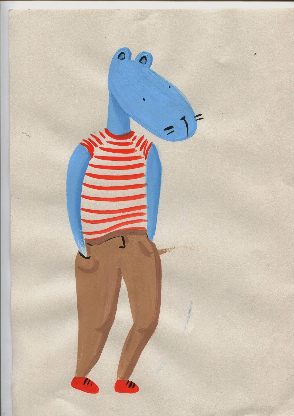
I've recently been drawing these humanoid critters during my periods of absent minded doodling so decided to develop them into something useful. I used them in my sketchbooks to practice drawing silly body forms and positions with various emphasising motion lines, so I figured I should develop this and draw them busting some moves.
critters doodled whilst listening to Bjorn Rune Lie
In an attempt to free up my drawing process I went straight to paint without sketching them, I think they look looser and more fun this way. Also more riddled with error.
ADD SKETCHBOOK DRAWINGS
I liked the dry texture of the motion lines in this one. Mostly I used straight gouache with no water to make the colour thick and dry.
I used promarkers for this one, mostly because its easier to put colours together when they already exist in the form of a pen. Since they're old and running out I managed to get different tones on the skin which I'm pretty pleased with. The exclamation lines are quite dodgy on this one, they have no consistency with the critters movement
I used an accented red on this one to contrast with the bland brown and blue, the colours dont quite fit together though.
two colours, light and dark
mixture of gouache for the body and dying promarker for the dress and lines
I like the texture I made on this dress, it makes it look light and floaty
Tried using blended shadows on this one, it didn't quite work as it looks a bit grimey. I started to consider the colour more here and deliberatly used opposite colours on the colour wheel.
I took more care with this painting and opted for a casual stance. Alas I smudged the paint at the last minute, but despite this I think the paint is neater but a little too rigid.
I tried to use contrasting colours again here but using promarkers limited the amount of shades available.
I found the white backgrounds to be something of a waste of space so I bought some coloured paper and made some more laboured paintings.
I tried to consider the colour wheel with this one and chose contrasting ones at different hues to avoid them clashing - yellow and purple/maroon, blue and orange. I was quite pleased with the painting but felt I could do more with it so I scanned it into photoshop and played about a bit.
I changed some parts of the figure like his broken arm and the shadow on the shorts, and added some smaller motion lines and details.
Using various adjustment settings like hue/saturation, colour balance and channel mixer I changed the colour palettes of the image to various other, arguably better ones. They are posted in my order of preference.
I think this project made me think about anatomy and making it believable yet abstracted. The drawings where I used reference were much more believable than when I made them up, but they were more rigid and less amusing, so I think I need to find a good balance between the two. Also I discovered how quickly you can totally change an image in photoshop, just by altering the colours, which is something I will definitely be using in future projects.


No comments:
Post a Comment