Green because focusing on green stuff
sunsphere simpsons reference
crystal palace with smoke
composition
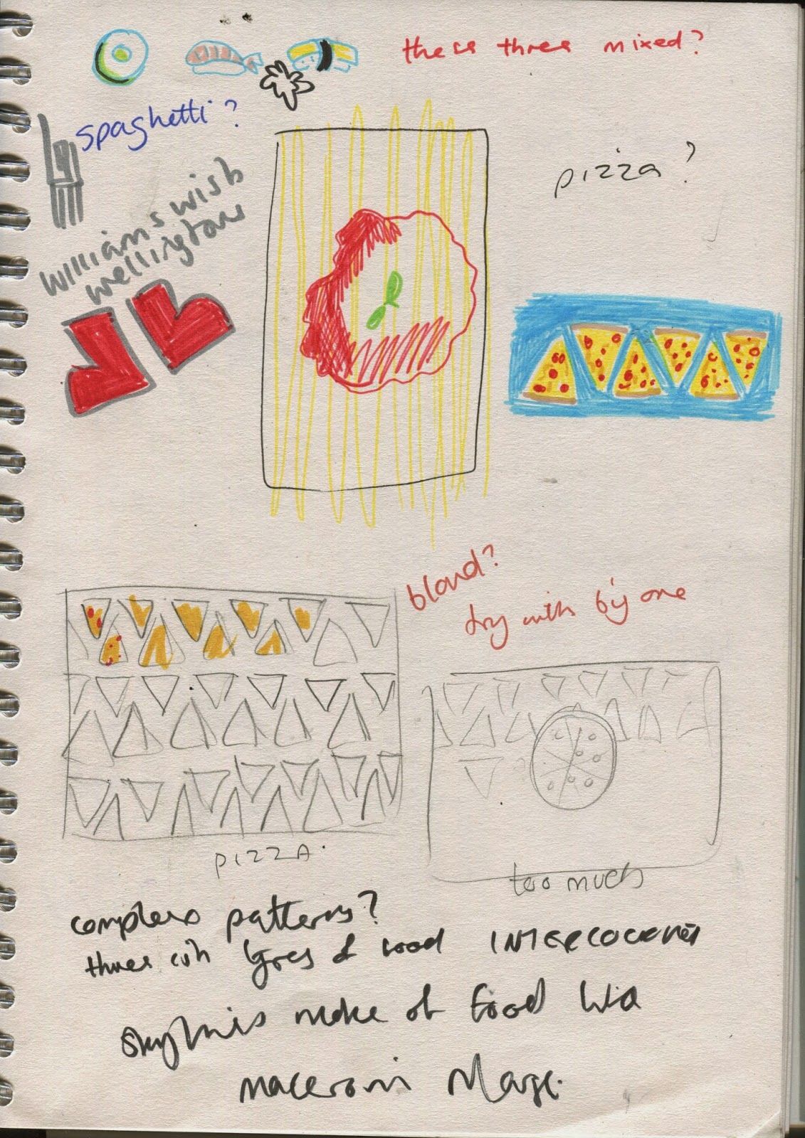
I spent quite a long time trying to decide on a concept for the postcards. Initially I planned to involve food from different countires, combined with famous city landmarks, such as in the thumb below of the Leaning Tower of Pizza, but making it out of pizza made the landmark pretty unclear because there was cheese where all the detail should be. It just looks like a rectangular pizza, so I gave up on this. Because I'd been drawing a lot of critters lately I thought about drawing animals or pests associated with different countries. I tried pigeons for London, rats for Paris, Tarantulas for Sydney and Godzilla for Tokyo. I wasn't totally pleased with this idea because it was very problematic to compose, since I wanted to involve both tiny animals (with the exception of Godzilla) and large landmarks, so if I drew both to scale you would obviously not be able to see the animals, but when I tried making them similar sizes it looked uncomfortable and clumsy.


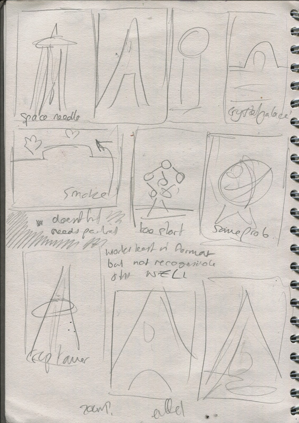
I chose the research I did into World's Fairs because they all had a monument of some kind erected for the occasion, many of which still stand today and are very famous. Here I listed important ones such as the Eiffel Tower, the Seattle Space Needle, the Crystal Palace, the Millenium Dome and so on


Most of the visual decisions I made took place on screen so I have little evidence of them.
I started with the space needle as it looked easiest and I'd never used Illustrator before. Its made with the pen tool as it was the tool I had the least amount of understanding of. I used a photograph of the landmark and using the pen tool traced all the individual shapes of the structure and pieced them one at a time back together onto a plain background. Because the drawing was quite complex I chose to do each one in different variations of the same colour. I think it simplifies the images and makes them appear more like a coherent set. The first two colour choices were arbitrary but the third was orange because its called the Sunsphere and is a coppery colour, and the last one green because the focus of that fair was sustainability and the environment.

Seattle, Washington - Space Needle 1962

Paris, France - Eiffel Tower 1889

Knoxville, Tennessee - Sunsphere 1982

Daejon, South Korea - Hanbit Tap (Tower of Grand Light) 1993

No comments:
Post a Comment