Tuesday 22 April 2014

End of Module Evaluation - Visual Language


Leeds College of Art
BA (Hons) ILLUSTRATION
Level
04
OUIL404 Visual Language
Credits
20
End of Module Self Evaluation

NAME
 Hollie Smith


1.  Which practical skills and methodologies have you developed within this module and how effectively do you think you are employing them within your own practice?

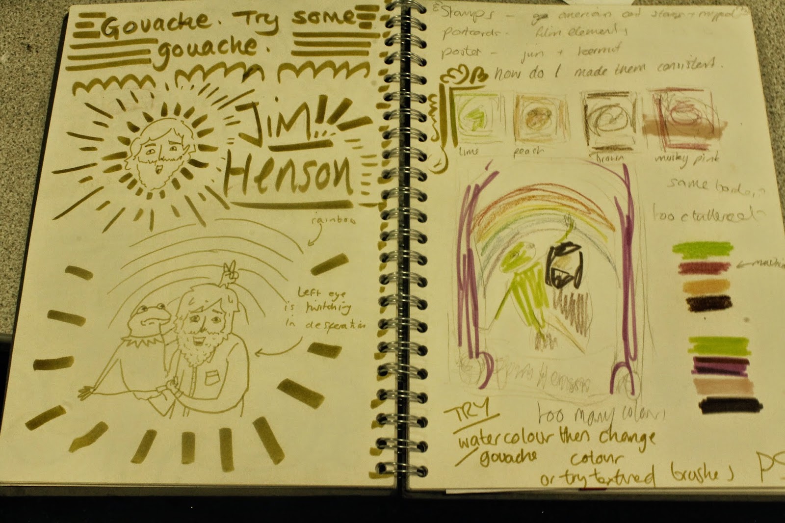
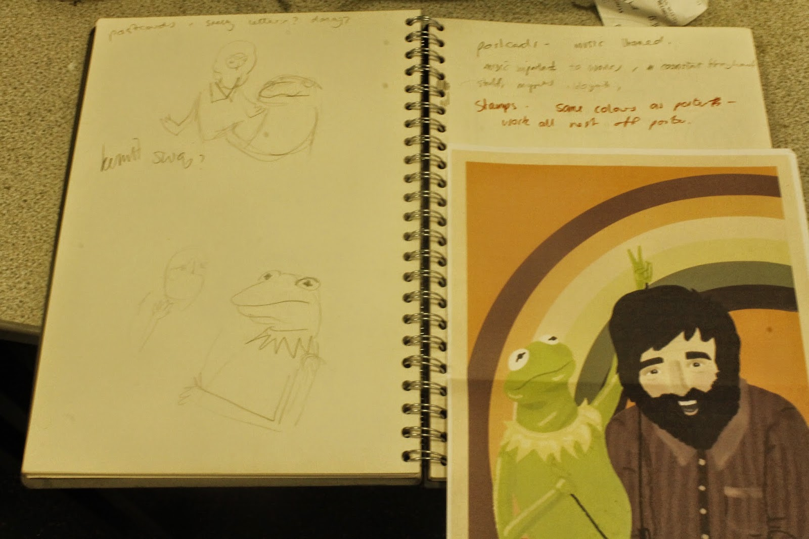
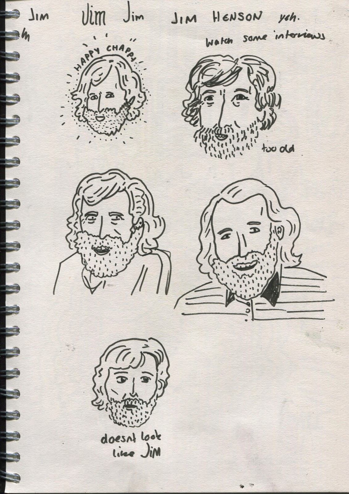
This module has made me think more about drawing to practice drawing, rather than drawing to answer a brief. At the beginning it was nice to draw something without a specific concept or point to communicate, but as the module progressed I enjoyed making some work with more content, but content more irreverent than whatever I was doing for the other modules. It also made me consider my use of materials, particularly at the beginning of the beginning of the module when we had to use a variety of tools for specific visual purposes, it made me push each tool more to try and fit it to the brief, like making textured shadow with pens. Also I got more experimental when drawing from horror movies as I had to find a way to to make a violent aesthetic. As well as this there's the printing skills I have learnt in the scheduled workshops which are definitely going to come in handy in future projects. 

2. Which principles/ theories of image making have you found most valuable during this module and how effectively do you think you are employing these within your own practice?
I found the focus on composition and frame the most useful because it's such an important aspect of illustration but can be easy to overlook when planning ideas and just drawing pictures. I now consider the composition of every thumbnail I make, and often vaguely plan the composition before I decide on the content of the image. I enjoyed reading about the technical side of illustration because I often feel like that knowledge is what my work lacks, and in particular the handout explaining what different dynamics of compositions suggest to a viewer.

3. What strengths can you identify within your Visual Language submission you capitalise on these?
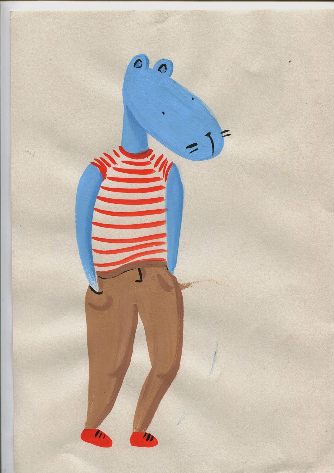
I'm pleased with the way I used things I'd been drawing in my recreational sketchbook to make fully formed pieces of work, it made my doodling feel useful. I'm most pleased with the Pegasus comic I did, which I would have never thought about or got around to making had it not been part of visual language, so perhaps towards the end it began to act as a conduit for ideas I wanted to pursue. Also the exhaustive practice of drawing something over and over again has now integrated itself into my practice as it's made me realise that the drawing gets better each time you do it, so now instead of labouring over one pencil sketch I will draw something repeatedly until I've learnt how to draw that thing, which I think is a much more useful skill as it helps me build up a back of images I can make, like clip art for my brain. 

4. What areas for development can you identify within your Visual Language submission and how will you address these in the future?
My main failure was failing to do things at the right time, both the briefs and blogging, because I ended up having to do a lot of work retrospectively, and making blog posts months after I'd made the work. I ended up changing the post dates of the late blog posts so they go on my blog chronologically and make it less confusing but it would've definitely been more useful to me if I'd reflected formally on the work straight after making it, because now I've forgotten a lot about what I was thinking and trying to do. Next time I will try, again, to keep on top of the blogging, perhaps eventually I will manage it.

5. In what way has this module informed how you deconstruct and analyse artwork (whether your own or that of contemporary practitioners)?
It has taught me to analyse work based on formal and theoretical aspects like frame and composition and line of sight, etc. I think it's given me a more in depth understanding of other practitioners thought processes when making images, and has made me consider these when looking at other peoples work. I find it much easier to talk about work because I know what to analyse and how to word my opinions. Also learning how my work could be analysed has made me think about drawing in these terms, so I will plan elements of an image and do things for a reason, rather than just doing what looked good. 


6.How would you grade yourself on the following areas:
(please indicate using an ‘x’) 

5= excellent, 4 = very good, 3 = good, 2 = average, 1 = poor

1
2
3
4
5
Attendance


 x

Punctuality


 x

Motivation


 x


Commitment


 x


Quantity of work produced


 x


Quality of work produced


 x


Contribution to the group

 x


The evaluation of your work is an important part of the assessment criteria and represents a percentage of the overall grade. It is essential that you give yourself enough time to complete your written evaluation fully and with appropriate depth and level of self-reflection. If you have any questions relating to the self-evaluation process speak to a member of staff as soon as possible.


A copy of your end of module self evaluation should be posted to your studio practice blog. This should be the last post before the submission of work and will provide the starting point for the assessment process. Post a copy of your evaluation to your PPP blog as evidence of your own on going evaluation.


Notes

Saturday 19 April 2014

Fire Hands


A belated effort for the Mutants brief. 
I was spending too long trying to think of a good super power to have and neglected to do anything useful so I settled on flame hands so I could focus on making something. This is my first attempt at a stop motion gif and I think it went pretty well for an hours work. I used scraps of tissue paper and stuck them to the wall in the most fire-like formations I could manage. My main struggle was trying to keep it consistent. I kept nudging the laptop so the frame moved around, and I found it hard to stick the next piece of fire onto the wall in the right position. Also I had to redo a lot of shots because I foolishly left debris in the frame. I tried to make it loop continuously but it still looks a bit shaky, I'll try to improve this next time. I really want to make more gifs because they're a quick and easy way to explore animation, so maybe after practising these I could make a more sustained piece of animation. 

Visual Language - Colour


I've recently been drawing these humanoid critters during my periods of absent minded doodling so decided to develop them into something useful. I used them in my sketchbooks to practice drawing silly body forms and positions with various emphasising motion lines, so I figured I should develop this and draw them busting some moves. 


critters doodled whilst listening to Bjorn Rune Lie

In an attempt to free up my drawing process I went straight to paint without sketching them, I think they look looser and more fun this way. Also more riddled with error.

ADD SKETCHBOOK DRAWINGS

I liked the dry texture of the motion lines in this one. Mostly I used straight gouache with no water to make the colour thick and dry.

I used promarkers for this one, mostly because its easier to put colours together when they already exist in the form of a pen. Since they're old and running out I managed to get different tones on the skin which I'm pretty pleased with. The exclamation lines are quite dodgy on this one, they have no consistency with the critters movement 

I used an accented red on this one to contrast with the bland brown and blue, the colours dont quite fit together though.

two colours, light and dark

mixture of gouache for the body and dying promarker for the dress and lines
I like the texture I made on this dress, it makes it look light and floaty

Tried using blended shadows on this one, it didn't quite work as it looks a bit grimey. I started to consider the colour more here and deliberatly used opposite colours on the colour wheel.
I took more care with this painting and opted for a casual stance. Alas I smudged the paint at the last minute, but despite this I think the paint is neater but a little too rigid.

I tried to use contrasting colours again here but using promarkers limited the amount of shades available. 


I found the white backgrounds to be something of a waste of space so I bought some coloured paper and made some more laboured paintings. 


I tried to consider the colour wheel with this one and chose contrasting ones at different hues to avoid them clashing - yellow and purple/maroon, blue and orange. I was quite pleased with the painting but felt I could do more with it so I scanned it into photoshop and played about a bit. 

I changed some parts of the figure like his broken arm and the shadow on the shorts, and added some smaller motion lines and details. 


Using various adjustment settings like hue/saturation, colour balance and channel mixer I changed the colour palettes of the image to various other, arguably better ones. They are posted in my order of preference.

I think this project made me think about anatomy and making it believable yet abstracted. The drawings where I used reference were much more believable than when I made them up, but they were more rigid and less amusing, so I think I need to find a good balance between the two. Also I discovered how quickly you can totally change an image in photoshop, just by altering the colours, which is something I will definitely be using in future projects.


Friday 11 April 2014

Jim Henson - Planning and Development


Decided to use Jim and Kermit idea, trying it in poster context

Trying out some fonts which I probably won't end up using but I like the colours of the second page, they seem to suit the project.

Selecting colours, I had a vague idea what I want but need to get a good mix of tones and complimentary but dissimilar colours so I can mix them to make lots more colours.

Decided on a toned down version of these colours, there will be more choice in Photoshop. Tried it with curtains, theatre style to reference the Muppet Show, I think it looks a bit cluttered though
Tried switching them around so Jim is the puppet, then found on pinterest it'd been done before

Finalising the composition.

Desingning stamps, thinking of things to put in the embelisments that represent the characters. Reeds and leaves for Kermit, for the swamp at the beginning of The Muppet Movie.


Stars and make up brushes for miss piggy.

Rubber chickens for Fozzie, potentially wakka wakka in the background, drum sticks for animal. He'll be leaping out of the frame, rather than sat in profile, in true Animal style

ADD OLD STAMPS

I started to make these ideas but half way through decided they were'nt consistant with the poster so I went back to developing and changed them to be more similar in structure to the poster with the rainbow in the background and the same colours. 

Replanning stamps and planning post cards. Didn't leave enough time to plan postcards as much as I'd have liked to. I was originally going to use scenes from musical numbers in Jim's works but I couldn't think of enough good ones and it was taking me too long to work out how to draw the Goblin King in a fitting way. I've decided instead to use Sesame Street characters.


Thursday 10 April 2014

Jim Henson - Initial Sketches and Ideas


Notes from a book called Imagination Illustrated: The Jim Henson Journals. Really good book, it was good to see exerpts from his calenders and diaries, shows his dedication to work. It was also interesting to read about the development of his career and his other talents like graphic design and comic making.

It seemed logical to start with Kermit, the first created and the most recognised puppet Jim Henson every created or performed.
Playing about with kermit, he looks odd when freestanding, but more odd when he's freestanding in actual movies. Witchcraft.

Trying to perfect that disapproving kermit face.

I started sketching Jim himself, focusing on his recognisable arrangement of hair and his cheery ever-present smile. Torn between cartoon and cartoonish realism.

A sketch of a poster-ish type thing. Mostly experimenting with colour


Watching The Dark Crystal

Watching Labyrinth 

The Goblin King, trying to make textures with felt pens

0.03 pen sketch of the Goblin King, slightly more refined.

Identifying key aspects of Jim Hensons life and personality 

Starting to plan stamps, imitating American 1 cent stamps

Trying out some poster ideas, decided on something quite simple

Playing with this idea, Kermit and Jim appearing to interact but making it clear that its just him alone, trying to show his talent for creating life in puppets.

Decided on this one, still trying to perfect the Kermit face