
Initial sketches- I started with a basic conflict eg. arm wrestle, tug of war, wrestling etc. as yet unsure which idea to fit in which box so testing them in varying ones

Here I began to think of an indifferent youth protest in response to the part in the article stating that the young people don't really know who they support or what they want. I tried some silly signs showing they're indecisiveness but these were too text heavy and didnt fit this long format. I shortened the sentences and chose the square format as it allowed for both the height needed for signs and the width for a massing crowd.


Here I picked up on the idea of a 'sovok' from the article, a person who is obsessed with Russia's soviet past. I began to depict this as a soviet Russia fanboy sitting in a lonely shrine room remembering the good old days.


I developed the arm wrestilng idea as I thought it was visually the strongest and would fit well to the long landscape format. I began experimenting with colour but had difficulty sticking to just three and keeping the distribution balanced.


I decided on the Russian flag colours red white and blue as my colour scheme because I thought it was the most striking and signified Russia more than other colours I'd tried. With the arm wrestling image I tried putting tattoos and markings on the arm to signify the old and young Russia but this looked too cluttered and conceptually blunt. I decided then to make my three images represent 1. the youth 2. the sovoks and 3. the conflict itself, as apposed to each one exploring all three.


Then I moved into photoshop to develop my final drawings. These are some sketches I tried out for the sovok image in photoshop. I chose a mixture of the 3rd and 4th sketches as they are the clearest and least confusing; the front view of the man meant too much information was necessary to depict him, making it cluttered. Also it made no sense that he'd face away from the shrine to lament it.
I used a distressed texture to enhance the image as they looked far too stark without.

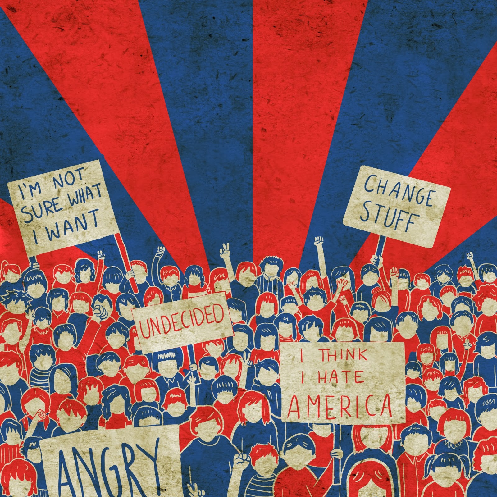

These are my finished pieces representing the struggle, the youth and the old Russia. I'm quite pleased with how these turned out considering my slow start to this project and how stumped I was originally. I thought the best way to convey such a complex article would be to use the most simple imagery and visual concepts possible, so I boiled it down to the three main elements.
Visually I'm again happy with the result. I think the restrictions were beneficial to me as I find it easier to make decisions when I have a guideline to react to, eg. I would probably not have chosen the Russian colours, or even considered what the colours communicated had I not had to plan the colours so strictly. The format restrictions meant I had to think how each piece would interact with its frame, so had to try each idea in the different frames and then manipulate the content of the image to best use the space.
I think I could've spent a bit longer crafting the drawings for the final images but I neglected to leave enough time so they were completed quite hastily. They suffered slightly from this time keeping error as some parts are untidy and in the crowd for example, some body parts don't make sense.


No comments:
Post a Comment