
One of my first ideas, a man repeatedly jumping from a tall building and failing to land safely..

I quickly settled on the failed desert idea, which started with souffles as they're so notoriously prone to failure. In these ideas I took 'fail better' to mean continue to fail but in a much more spectacular way, rather than improve the result.

I moved onto cakes because they are a more recognisable symbol than souffles. With cakes the first two were burnt and the third burnt and iced.
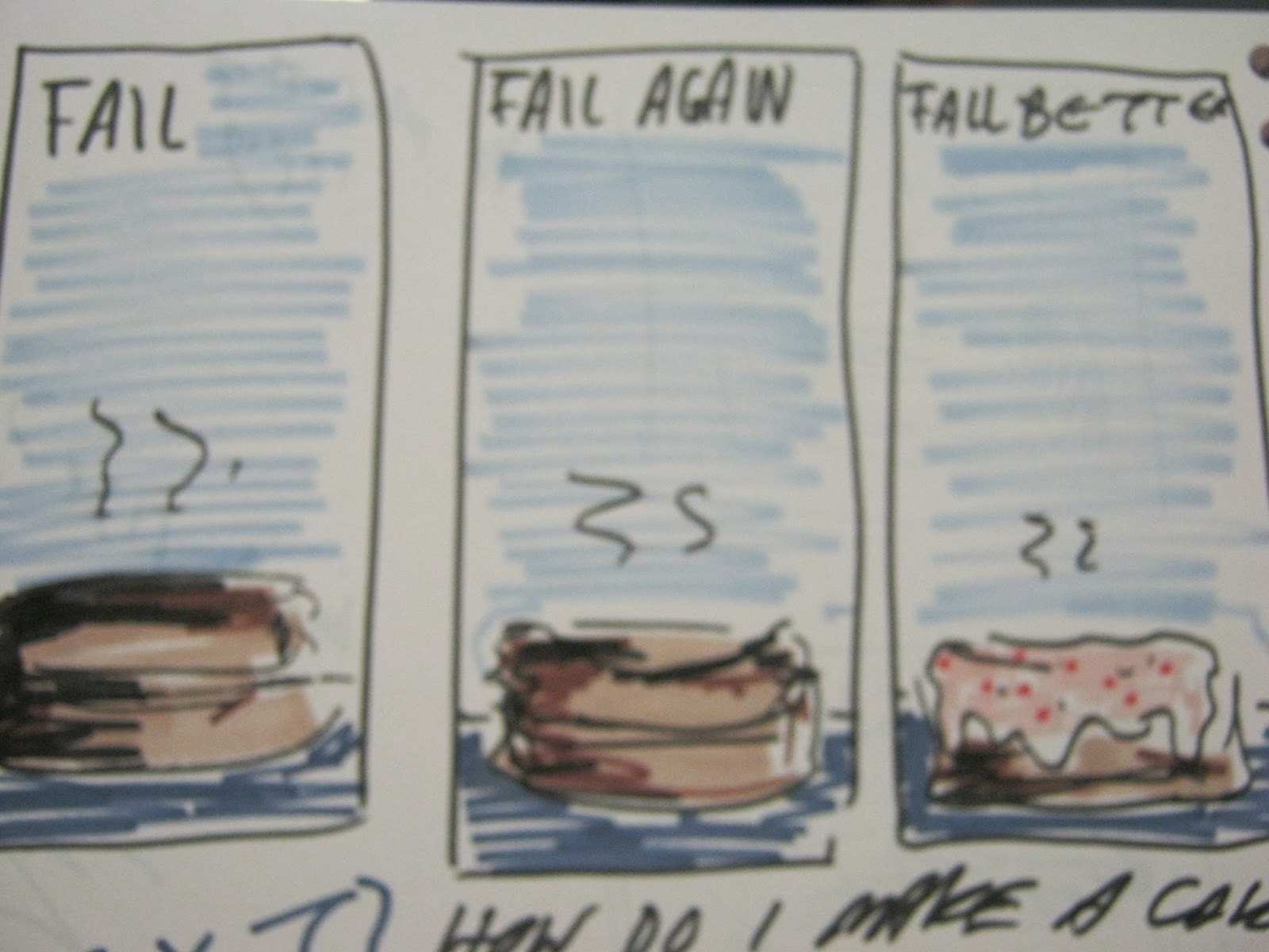
This is where I tried the format I eventually decided to use. Compared to the other squarer formats I thought this one looked more comfortable, the others looking too squashed and plain. I ended up using this colour scheme also.


I tried using cut paper but couldn't make the cake look partially singed, but I liked the collage effect as it suited the blocky graphic shapes in the image, and gave it a handmade feel.


I decided the type would be block capitals cut from the dark blue background paper to limit the colours, I could however have done more exploration into the type I used.

In further tests I decided to make the burnt cake all black to simplify the information as much as possible. To fill up the empty space I added small parks to depict the action of the cake.


I'm a little underwhelmed by my final images, perhaps as I didn't push the idea as far as I should've. I think I struggled most with the freedom of this brief as I like to react to strict guidelines and often find myself stumped if I don't have much of a given starting point; just choosing the quote took several days. I'm not entirely happy with the cakes, particularly the second and last as they look a bit flat and dull. Also I think I left a little too much space both above and below the cakes so the whole image looks too empty. Perhaps the type could have been bigger, definitely more crafted.
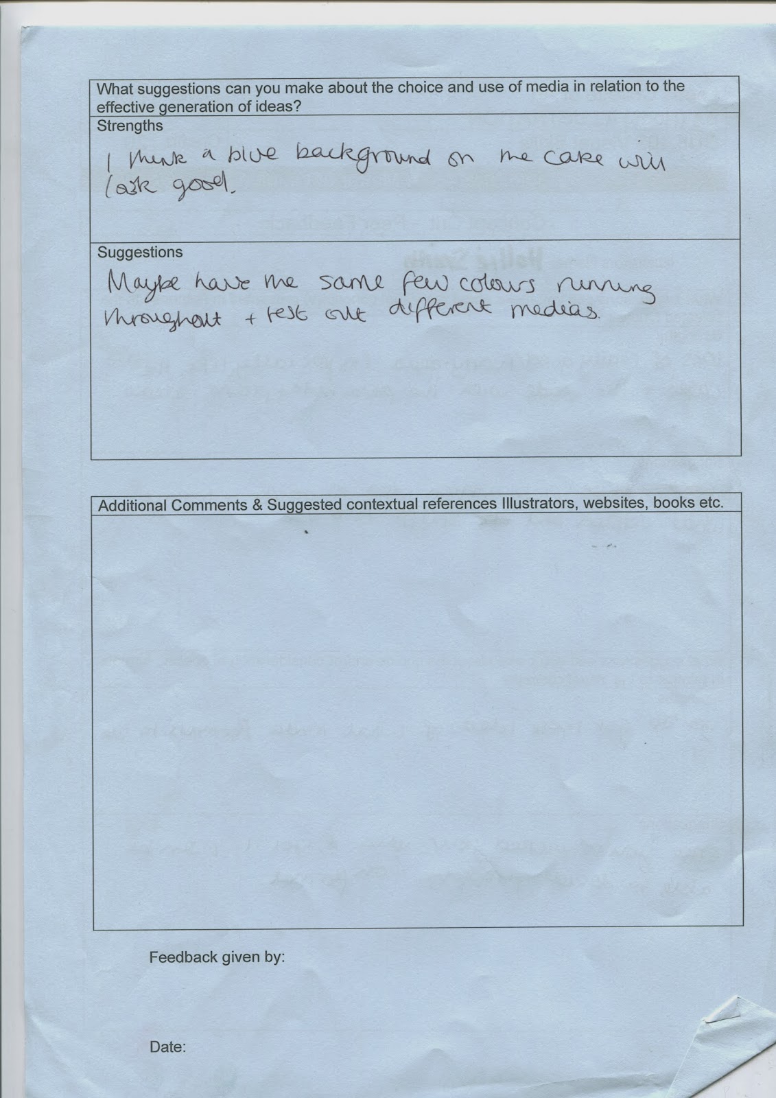
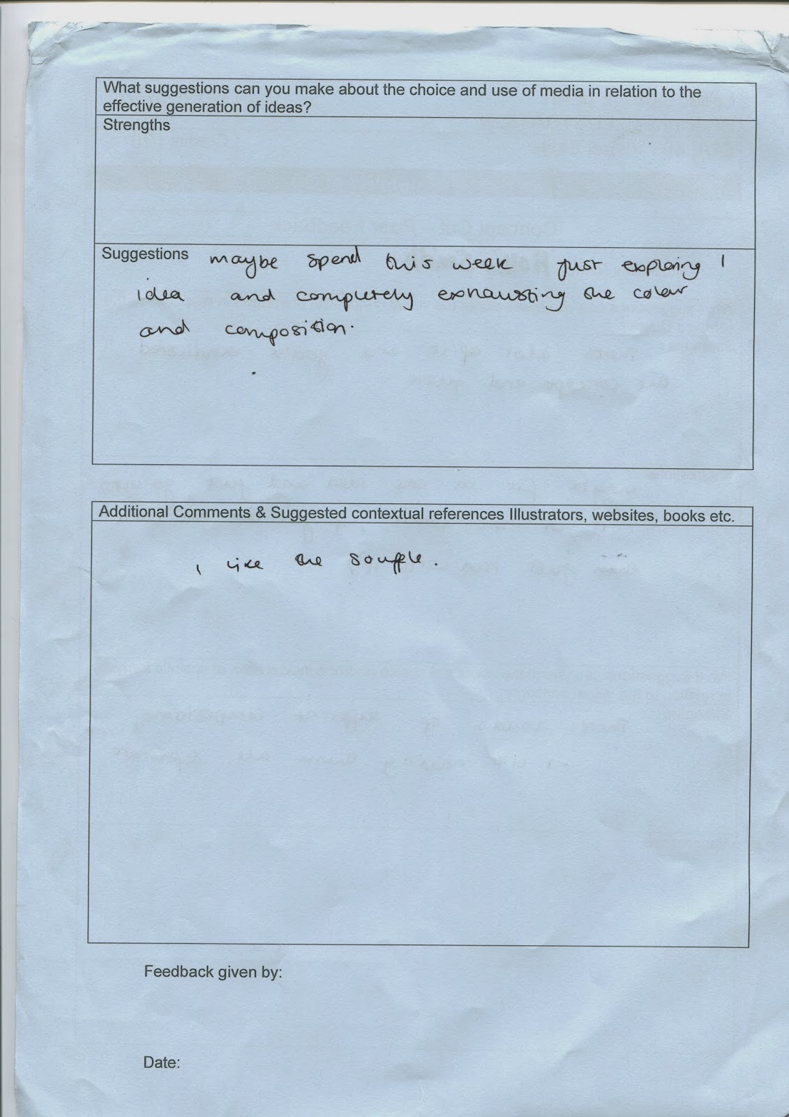
Here's my feedback sheets form the concept crit.


 The feedback mostly mirrored my thoughts about the work I presented, so helped me to decide which idea to continue with.

 The top sheet is only negative feedback, the bottom positive. I found the negative sheet most useful as a lot of people picked up on things I didn't think about, and they otherwise might not have mentioned because they were being forced to be critical. Mostly the typography comments as it's something I'd barely considered when making it so failed to realise the effect it can have on the image.

Here's my feedback sheets form the concept crit.


No comments:
Post a Comment