Friday, 22 November 2013

Texture


I started by trying to create texture with a fine pen using scribbled lines to texture the shadowed areas

I tried the same again with thicker pens but was less successful. The bottom right went okay, I did the linework in one pen and the textured shadow in a lighter one. 

Bored with pens I moved on to more experimental materials, here I covered a page of notes with ink and drew on it in tipex, I think I achieved a more interesting texture this way but I lost some of the detail.

This was drawn in brush pen. I did the blocked areas while it was full and then the dry brushed areas when it started to run out. It could stand to be much neater but I managed to get most of the shadows in the right place.

I painted the bottom layer loosely in ink, leaving blank parts where the highlights were, and went over it roughly with a red marker in the shadowed areas. 

I used pretty much every marker pen I own in this drawing, trying to make it look grotesque and violent with multiple layers of block scribbled colour, and tipex for shiny highlights.

I used a blunt coloured pencil to sketch in the hallowed areas of his face and the shadows, and then sharpened it for the more detailed areas. 

I cut out a stencil of the highlighted parts of Freddie's face to try and get the colour to hit the shadows. I stuck it down and flicked ink onto it with a toothbrush and paintbrushes, I like the texture the ink made but the image isn't very clear. Maybe I could work into it and add the features and details in a darker pen.

I'd been using this sheet of paper to dry off my brush when drawing something else, so I used it as a background and drew onto it with different pens.

Trying once again to create texture with different fixed width pens

My brush pen was running out of ink so I took advantage of the dry brush effect it was making

I drew a rough pencil sketch of the face and layered several colours of marker pen onto it. The combination of the graphite and the ink smudging made a jaggedy mottled texture. 

Saturday, 16 November 2013

Studio Brief 4 - A Matter Of Opinion

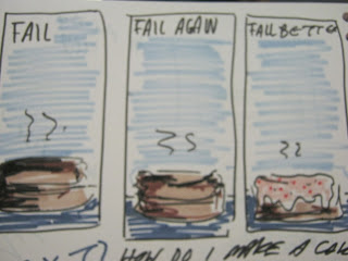
Quote - Fail. Fail again. Fail better.

One of my first ideas, a man repeatedly jumping from a tall building and failing to land safely.. 

I quickly settled on the failed desert idea, which started with souffles as they're so notoriously prone to failure. In these ideas I took 'fail better' to mean continue to fail but in a much more spectacular way, rather than improve the result. 

 I moved onto cakes because they are a more recognisable symbol than souffles. With cakes the first two were burnt and the third burnt and iced.

 This is where I tried the format I eventually decided to use.  Compared to the other squarer formats I thought this one looked more comfortable, the others looking too squashed and plain. I ended up using this colour scheme also.


I tried using cut paper but couldn't make the cake look partially singed, but I liked the collage effect as it suited the blocky graphic shapes in the image, and gave it a handmade feel.


I decided the type would be block capitals cut from the dark blue background paper to limit the colours, I could however have done more exploration into the type I used.

 In further tests I decided to make the burnt cake all black to simplify the information as much as possible. To fill up the empty space I added small parks to depict the action of the cake. 


 I'm a little underwhelmed by my final images, perhaps as I didn't push the idea as far as I should've. I think I struggled most with the freedom of this brief as I like to react to strict guidelines and often find myself stumped if I don't have much of a given starting point; just choosing the quote took several days. I'm not entirely happy with the cakes, particularly the second and last as they look a bit flat and dull. Also I think I left a little too much space both above and below the cakes so the whole image looks too empty. Perhaps the type could have been bigger, definitely more crafted.


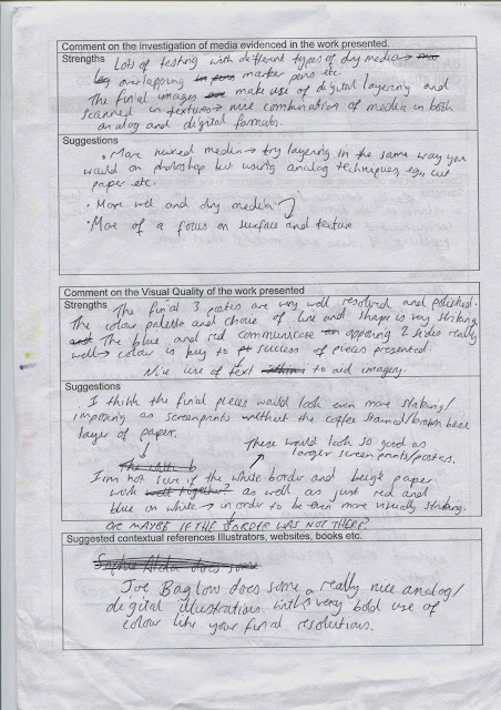
Here's my feedback sheets form the concept crit.


 The feedback mostly mirrored my thoughts about the work I presented, so helped me to decide which idea to continue with.

 The top sheet is only negative feedback, the bottom positive. I found the negative sheet most useful as a lot of people picked up on things I didn't think about, and they otherwise might not have mentioned because they were being forced to be critical. Mostly the typography comments as it's something I'd barely considered when making it so failed to realise the effect it can have on the image.


Monday, 4 November 2013

Visual Language - Studio Brief 3

Russia's Search For Itself


Initial sketches- I started with a basic conflict eg. arm wrestle, tug of war, wrestling etc. as yet unsure which idea to fit in which box so testing them in varying ones
Here I began to think of an indifferent youth protest in response to the part in the article stating that the young people don't really know who they support or what they want. I tried some silly signs showing they're indecisiveness but these were too text heavy and didnt fit this long format. I shortened the sentences and chose the square format as it allowed for both the height needed for signs and the width for a massing crowd. 


Here I picked up on the idea of a 'sovok' from the article, a person who is obsessed with Russia's soviet past. I began to depict this as a soviet Russia fanboy sitting in a lonely shrine room remembering the good old days. 


I developed the arm wrestilng idea as I thought it was visually the strongest and would fit well to the long landscape format. I began experimenting with colour but had difficulty sticking to just three and keeping the distribution balanced.


I decided on the Russian flag colours red white and blue as my colour scheme because I thought it was the most striking and signified Russia more than other colours I'd tried. With the arm wrestling image I tried putting tattoos and markings on the arm to signify the old and young Russia but this looked too cluttered and conceptually blunt. I decided then to make my three images represent 1. the youth 2. the sovoks and 3. the conflict itself, as apposed to each one exploring all three.


Then I moved into photoshop to develop my final drawings. These are some sketches I tried out for the sovok image in photoshop. I chose a mixture of the 3rd and 4th sketches as they are the clearest and least confusing; the front view of the man meant too much information was necessary to depict him, making it cluttered. Also it made no sense that he'd face away from the shrine to lament it. 
I used a distressed texture to enhance the image as they looked far too stark without. 


These are my finished pieces representing the struggle, the youth and the old Russia. I'm quite pleased with how these turned out considering my slow start to this project and how stumped I was originally. I thought the best way to convey such a complex article would be to use the most simple imagery and visual concepts possible, so I boiled it down to the three main elements. 
Visually I'm again happy with the result. I think the restrictions were beneficial to me as I find it easier to make decisions when I have a guideline to react to, eg. I would probably not have chosen the Russian colours, or even considered what the colours communicated had I not had to plan the colours so strictly. The format restrictions meant I had to think how each piece would interact with its frame, so had to try each idea in the different frames and then manipulate the content of the image to best use the space. 
I think I could've spent a bit longer crafting the drawings for the final images but I neglected to leave enough time so they were completed quite hastily. They suffered slightly from this time keeping error as some parts are untidy and in the crowd for example, some body parts don't make sense.