These all ended up being a mixture of shape and texture, despite my efforts to just draw in shape. This definitely needs practice, I struggle with minimalism sometimes.

Watching Evil Dead at a friend house, I had to draw quickly so as not to piss everyone off, so I used quick materials and scrappy lines. I tried to draw in shapes rather than lines but the drawings don't really look as shape based as I'd have liked. This one was a combination of ink, watercolour and marker pen for details

Because I was drawing shapes in pen I found it hard to keep the proportions correct, so Ash on the left is tiny, but aside from that I'm quite pleased with the block shadow I did on the faces. This was all layers of promarkers.
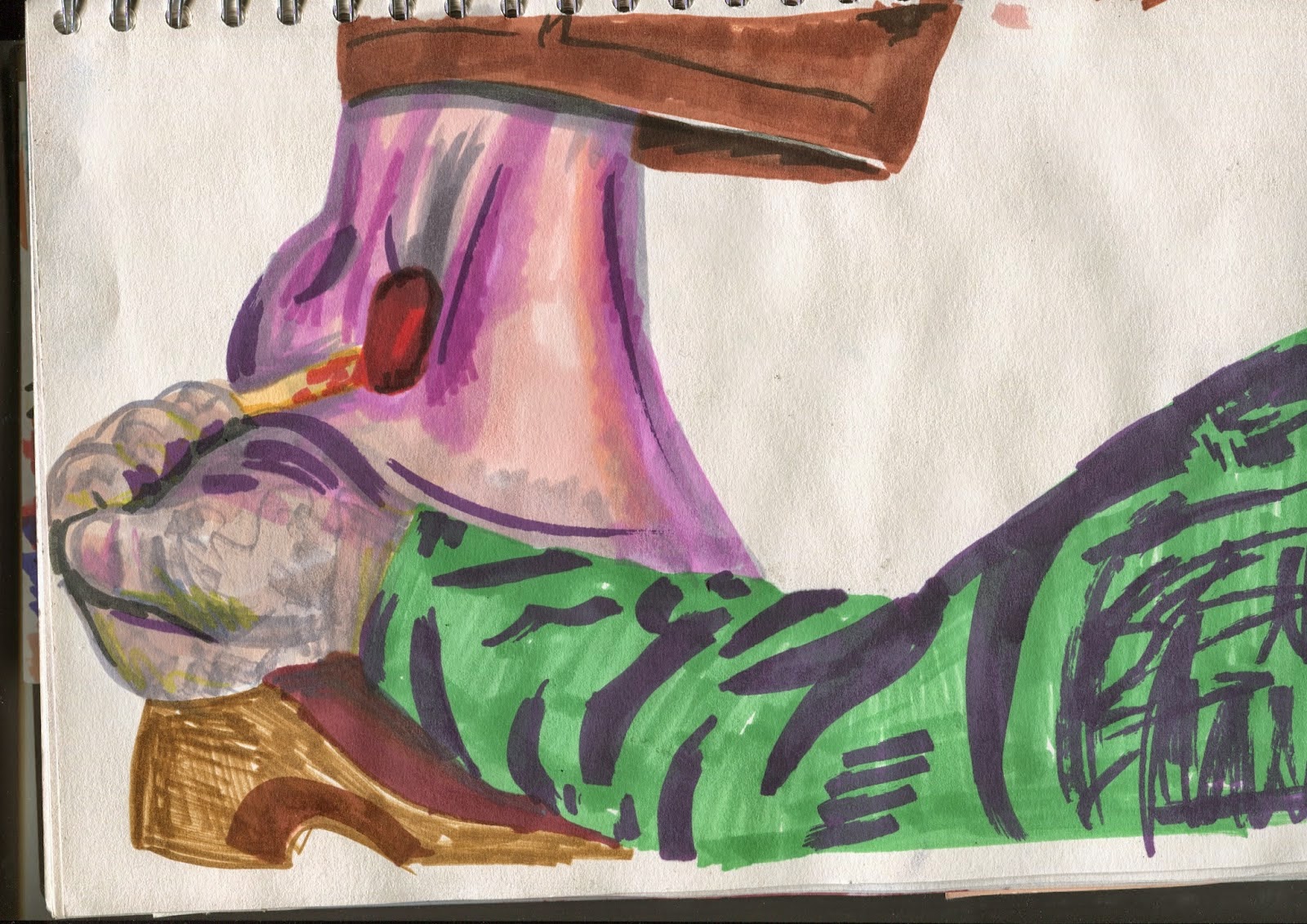
I used a lot of garish colours in this one to make it look as grotesque as the scene is, its less shape based than I intended because I ended up blending pens together to make the foot look gorier. The shirt sleeve was perhaps a bit too blocky though.
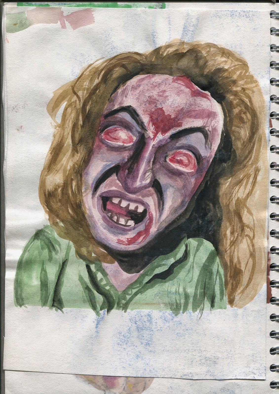
This painting started off as shape based but I got a bit too into putting texture into the face. Very disproportionate.

I'm quite pleased with this drawing, I tried to draw the shapes in a lighter blue and then the detail in smaller shapes in a darker blue, then the blood in red to accent it. I like the texture of the coloured pencil.

These were some quick marker sketches, on the left I used the brush end and on the right I used the chisell end. A combonation of both would be best as the left face looks best but the right dress is also best, perhaps because I drew it in lines of the same direction. I tried to draw just the shapes of the shadows but again ended up using some lines.

I drew the block shapes of the shadows of his face with a marker but it looked too bland so I used a graphite stick to add some texture. It looks pretty rubbish though, and I misplaced the shadow giving him an accidental hitler moustache.

I used the same technique again but with more apt colours and more carefully placed shadow. This one was more successful as I put more time and thought into it.

This drawing was more playful. I used blue ink to splatter and drybrush over the blue marker pen shadows

Here I did the same again but used the ink for the shadows instead, and used more dry brush on the face.

I drew this loose line drawing, using scribbled lines to show the violent movement, and then used smaller block shapes of watercolour to detail the figures. I think the way the watercolour bled with the pen, particularly on the faces, made it look more horrifying.

I tried a similar process to the above but reversed, so I made the ink shapes first and then added the detail in pen afterwards. I like the expression I gave leatherface, its pretty terrifying, he looks insane.

I used the same technique on this image for the figures and filled in the background areas with drybrush to make the figures stand out. I quite like this one, I think there's a decent balance of tone and I like the looseness of the figures, like on the right where the detail of the face goes outside of the ink shape.

I reused a stencil I made for the texture brief to paint into the holes with ink. This one worked out better because the defined shapes have the clarity the other image lacked. I used dry brush to make his scary knife fingers.
No comments:
Post a Comment